https://youtu.be/rs77EIvvrBQ
Summary
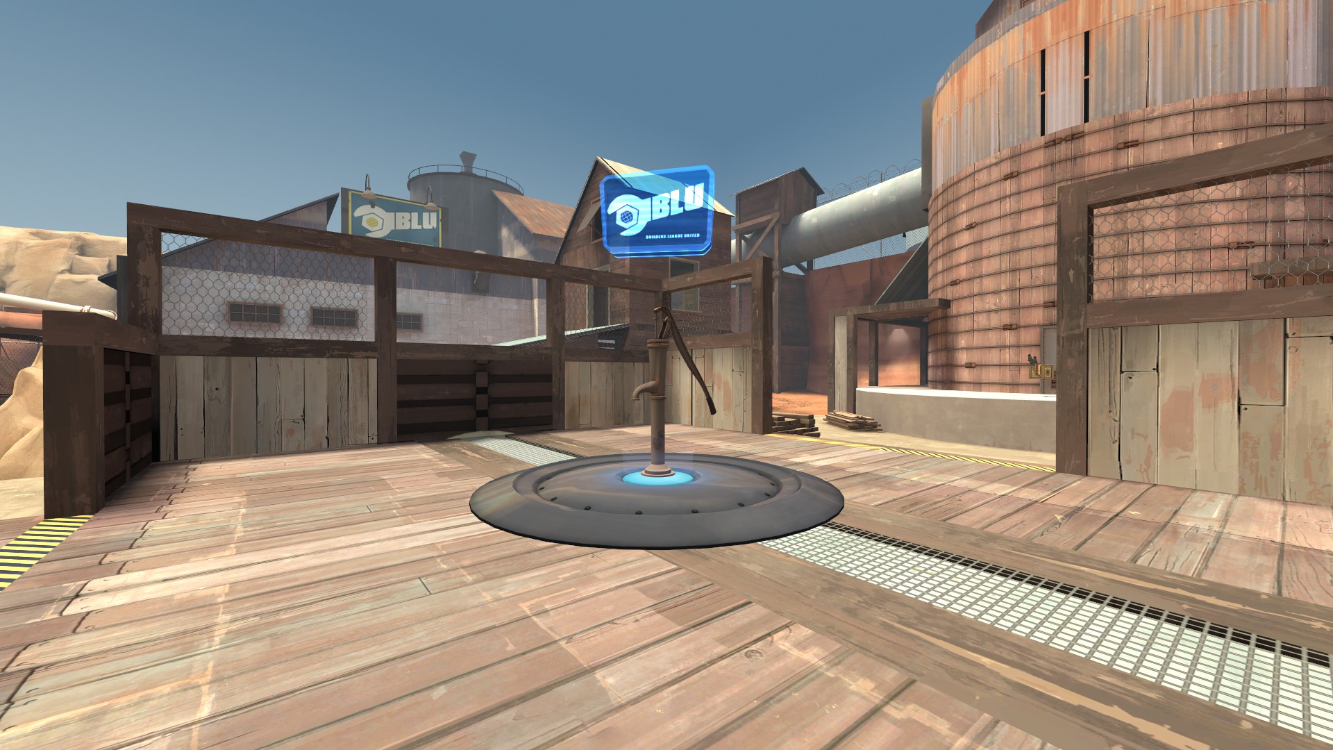
Drought is a King of the Hill-map where the goal is to capture and hold a single capture point.
My main goal with the project was to create a map that could support different styles of play. The short deadline also provided an opportunity to test my ability to work in a structured manner.
Specifications
- King of the Hill-map
- Created at The Game Assembly
- Development time: 3 weeks half-time
Tools
- Hammer SDK
- Photoshop

Early experimentation
The maps original concept was for it to take place on top of, and around, a hill. This was mainly because I thought it would be fun to be king of a literal hill. (Basing a map on a pun, it turns out, wasn’t a great idea)
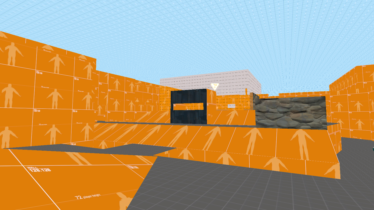
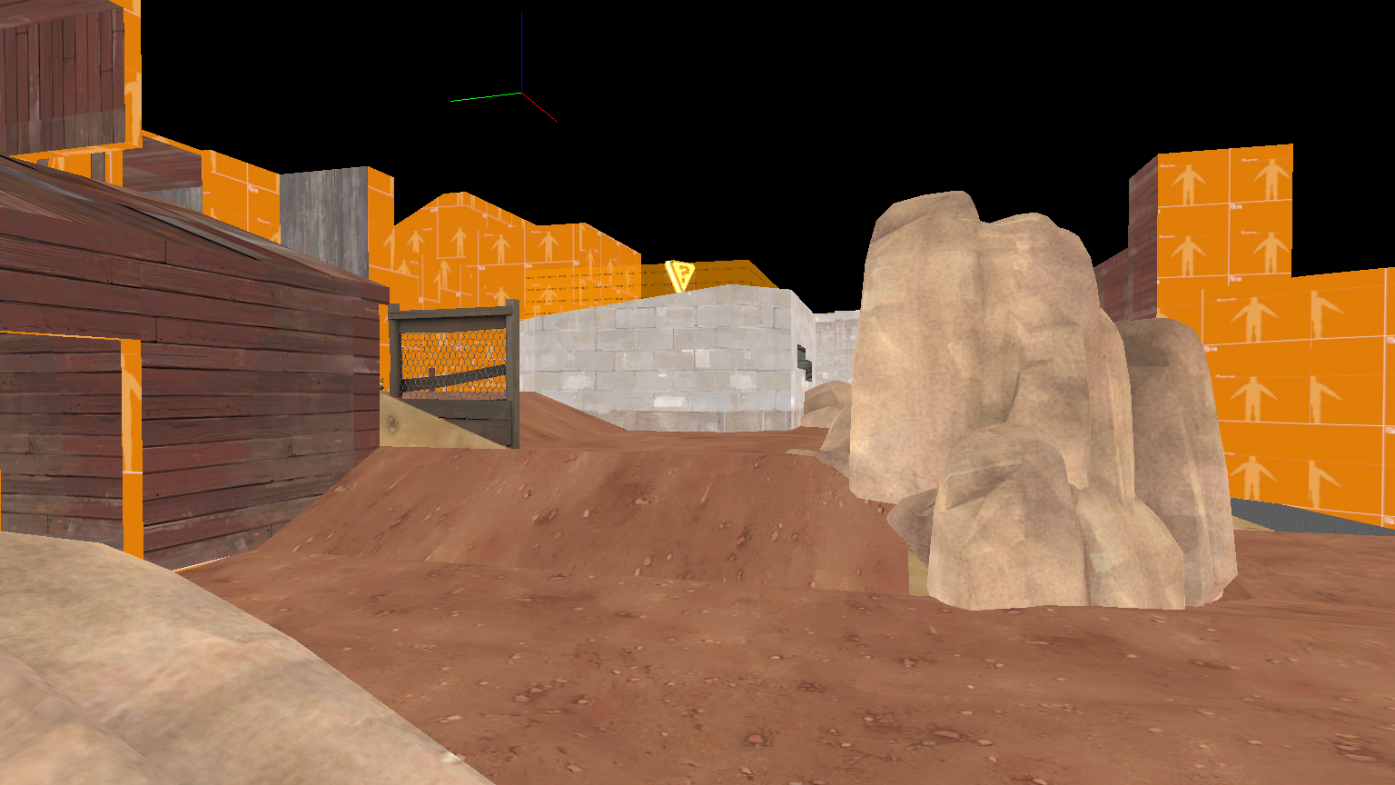
I made several different top-downs and blockouts, and asked people familiar with the game to explore the different layouts and give feedback about what worked and what didn’t.
Most of the issues with the original designs came from the height advantage of the hill, as it provided too much of an overview of the opposing teams side. A sniper would greatly outgun a heavy in most situations.
This resulted in the hill getting lowered each iteration, until it wasn’t really a hill any more. Combined with the fact that there weren’t that many assets to support the war-torn trench warfare I originally envisioned, I decided to take the map in a different direction.
Theme Change
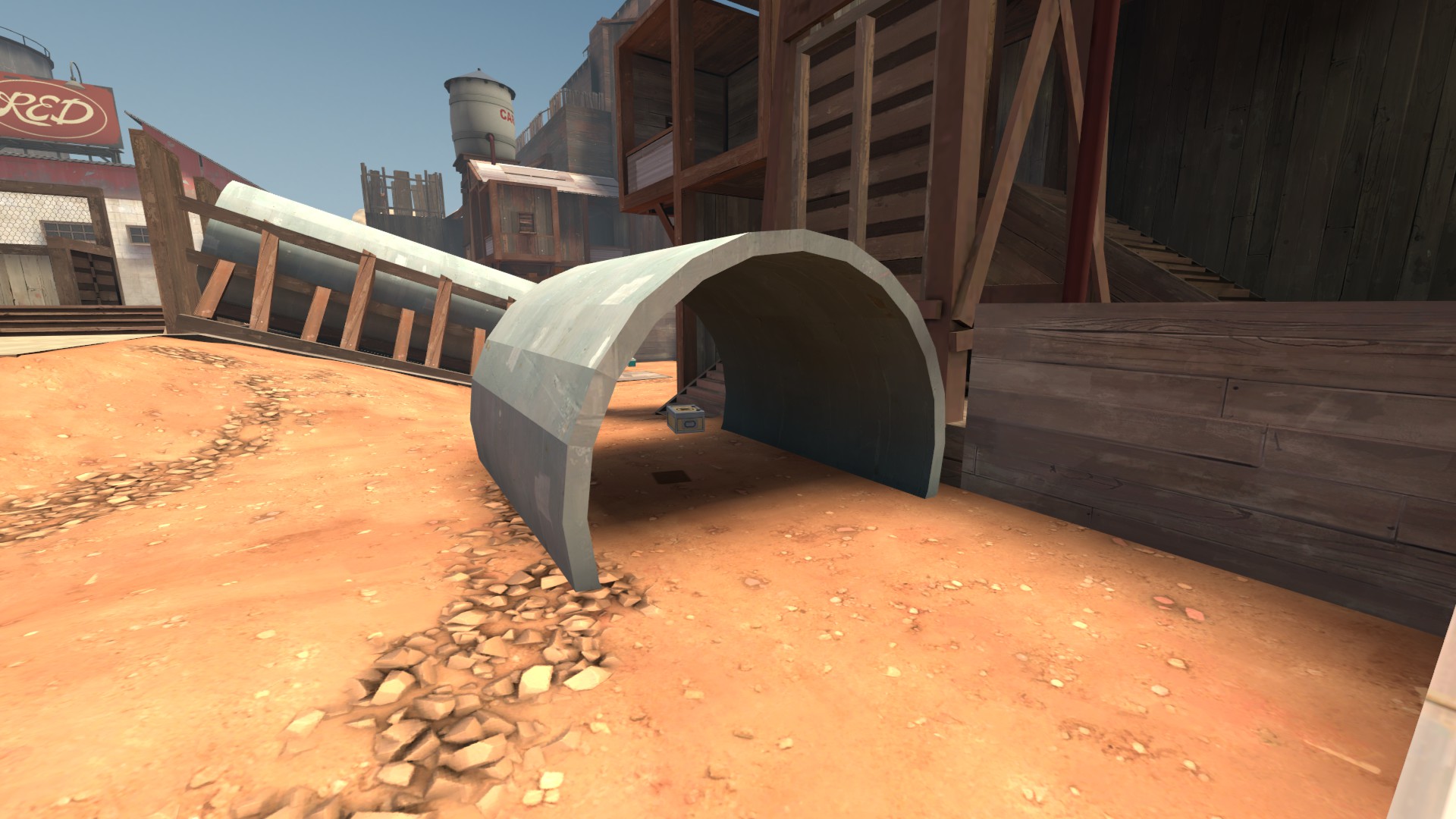
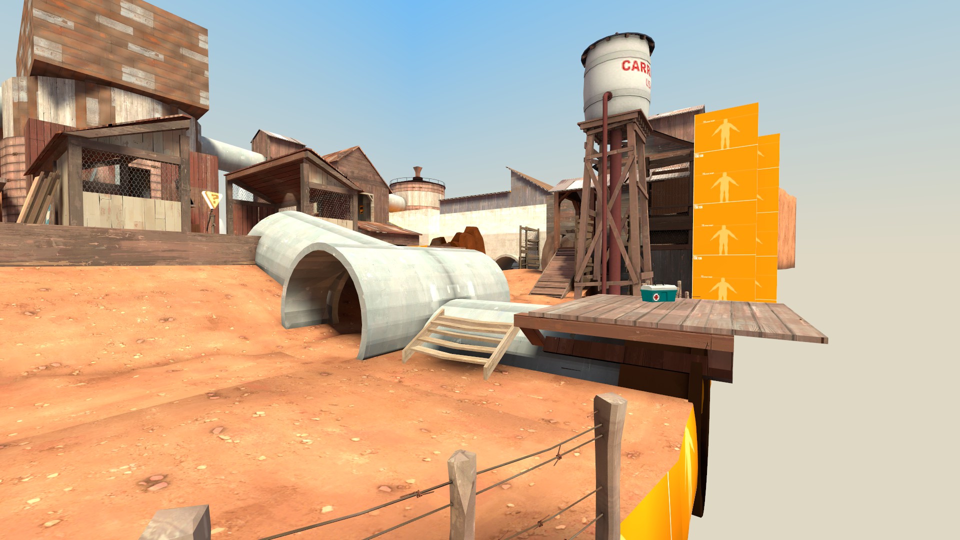
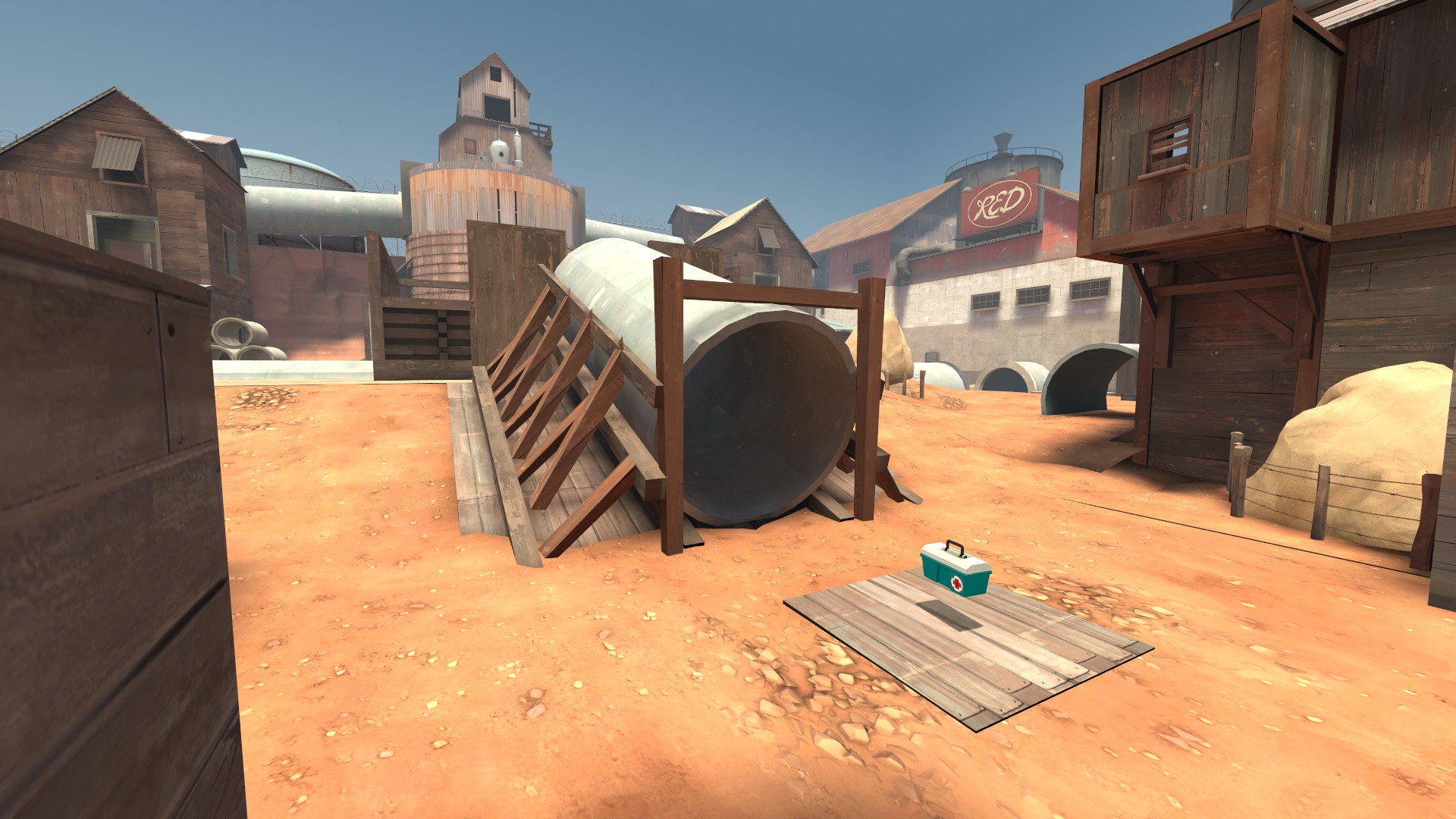
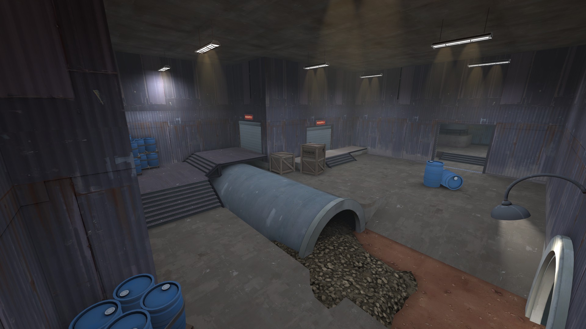
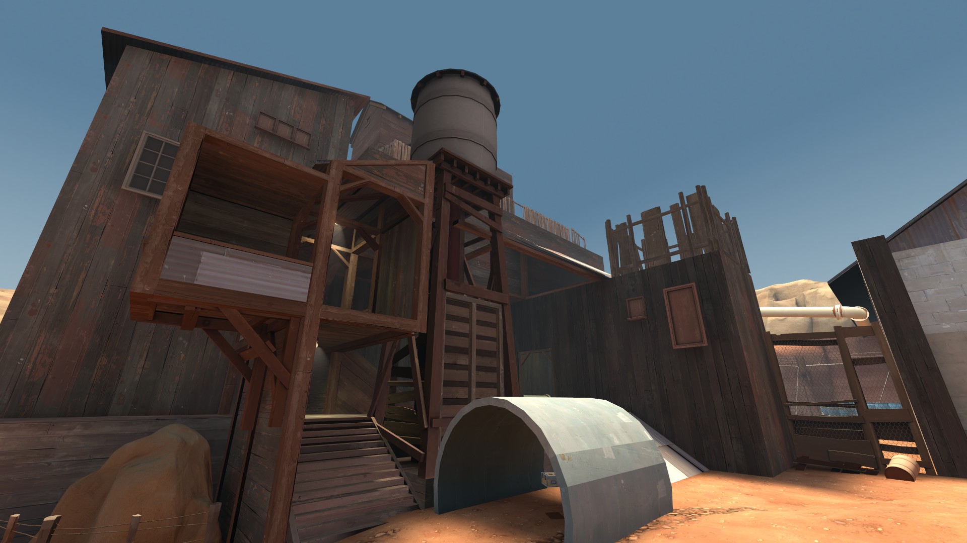
One concept that emerged from experimentation was hollowed out pipes that you could use for cover, run across or run through.
I liked the dynamic enough that I decided they should be the main gimmick of the map, and subsequently altered its setting and layout to revolve around waterpipes.
Designing the layout : Pathways
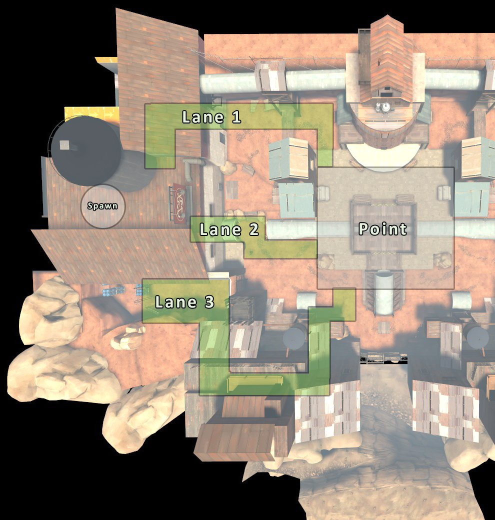
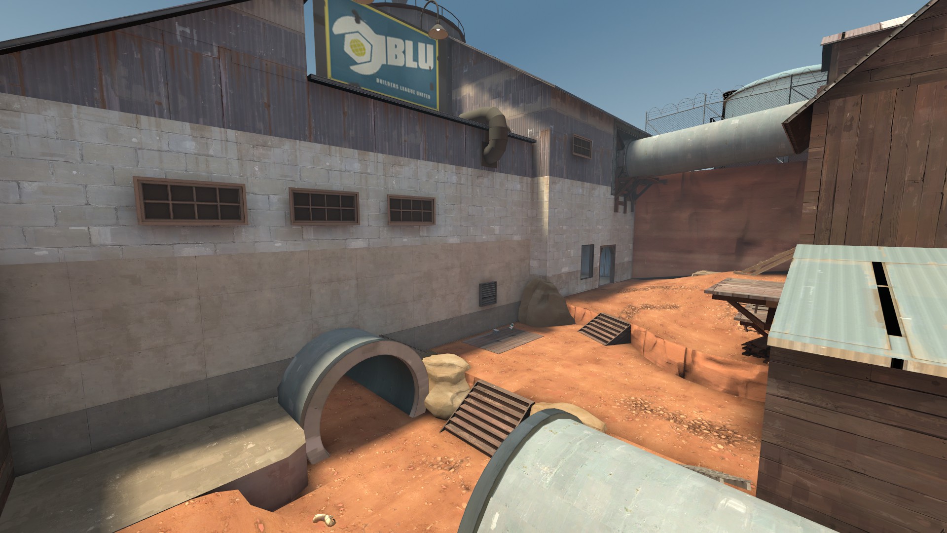
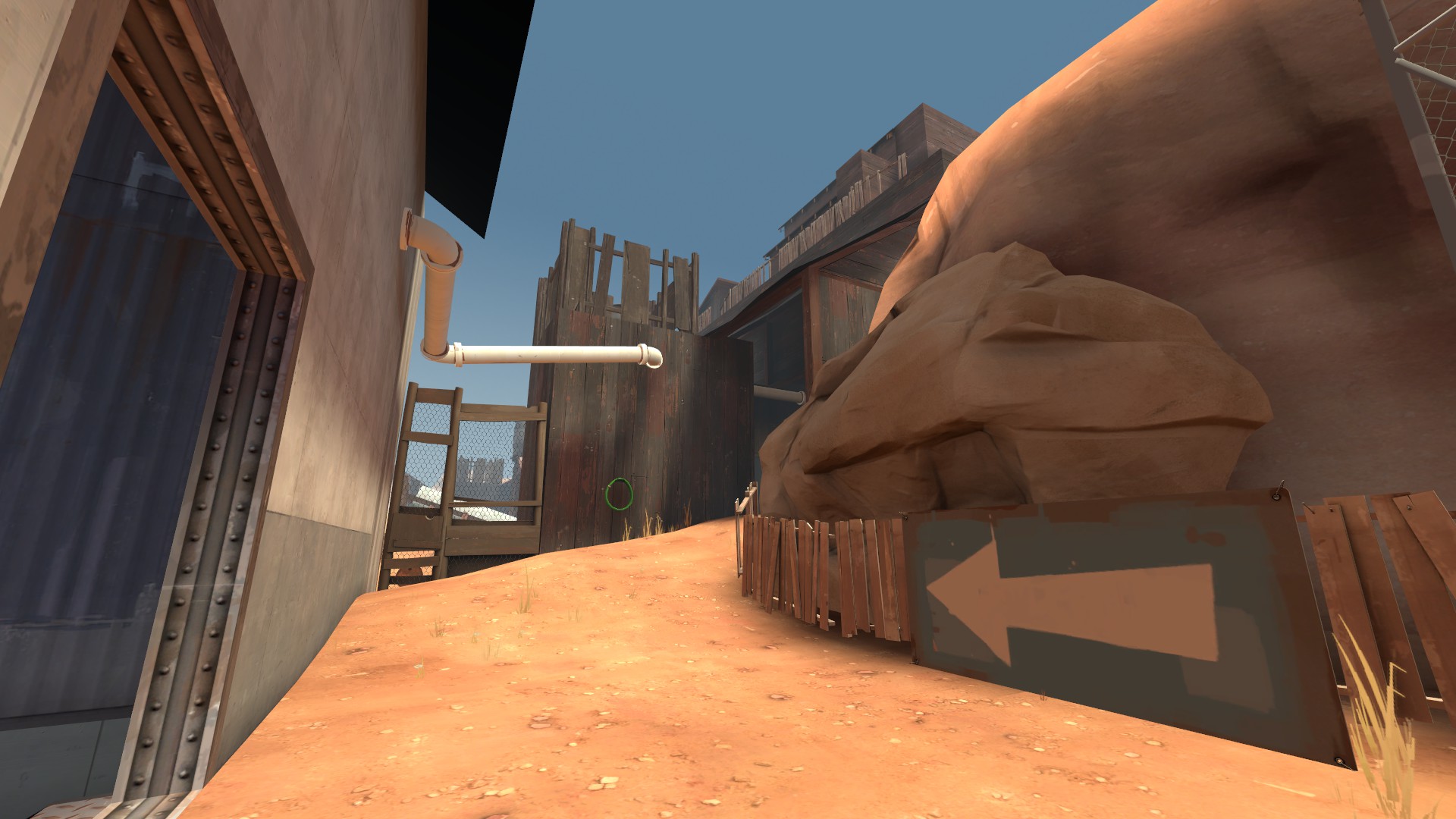
When designing the different paths leading up to the capture point I tried to differentiate each lane by assigning them different characteristics and goals:
-
Lane 1: Relatively safe from snipers, but at a greater distance away from point than (2).
-
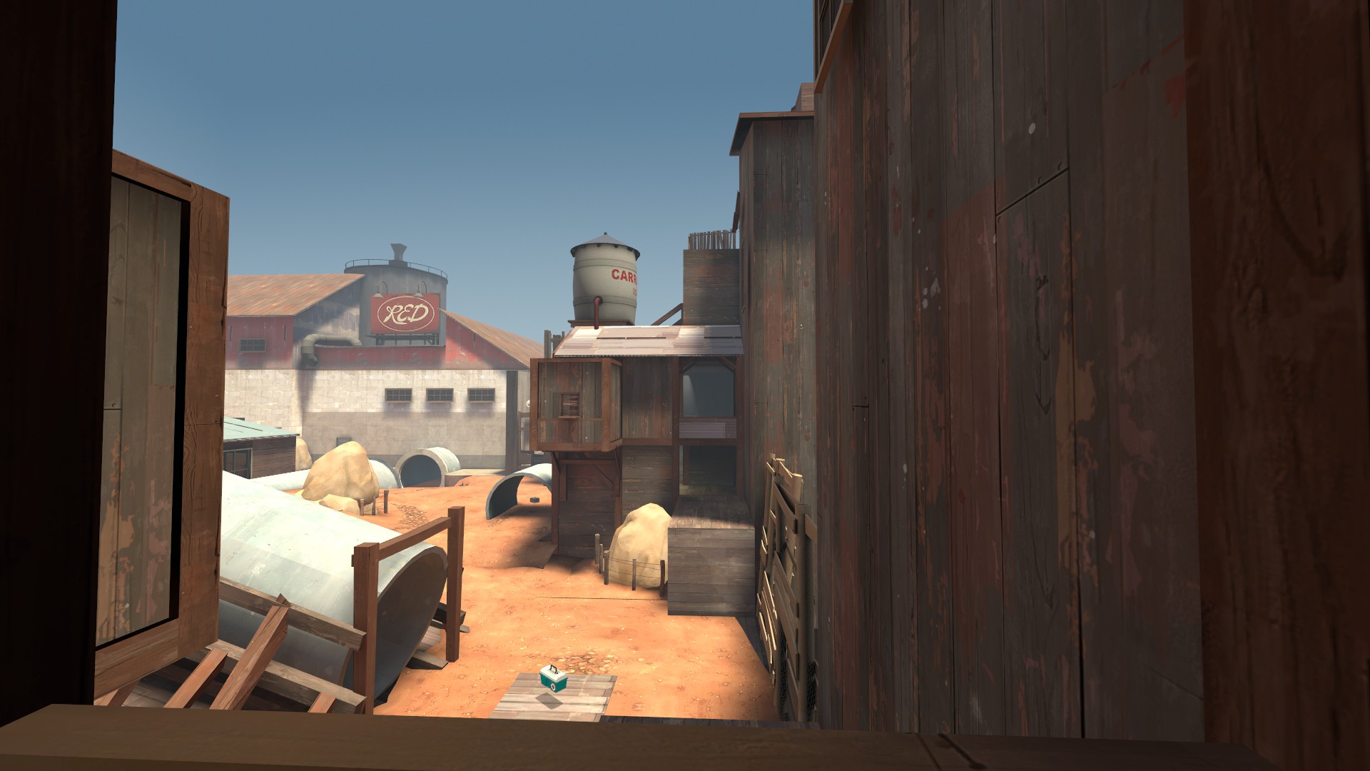
Lane 2: Fastest route, but also the most exposed. Provides the most branching paths.
-
Lane 3: Safest, but also has the longest distance to the point. Useful for flanking and sniping.
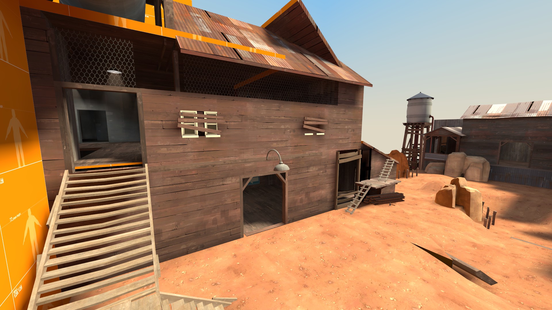
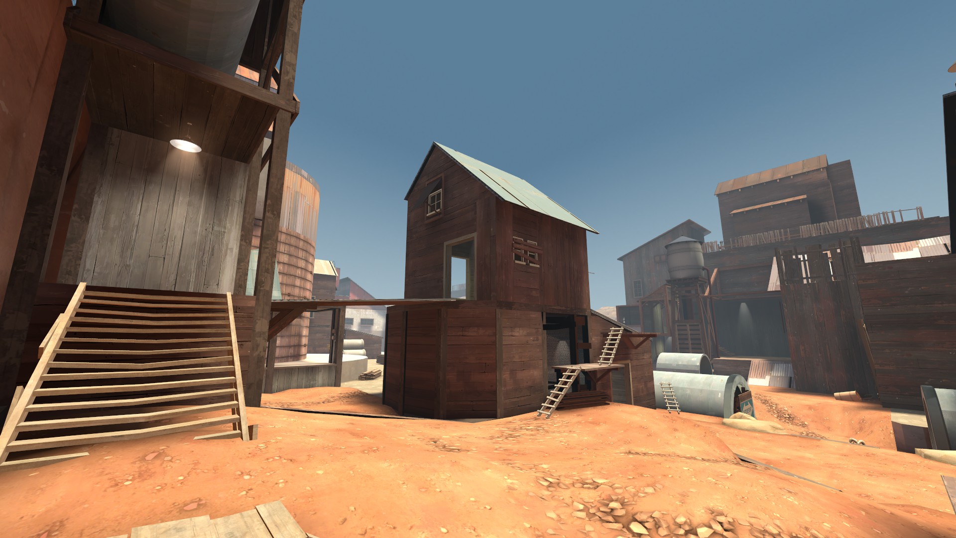
A problem that came up during playtests was that players overwhelmingly gravitated towards lane 1. The lane led to a big barn, which contained flanking routes and exits facing the capture point. This made it too advantageous compared to other areas.
Hence, I split the barn up into several smaller structures. This retained the function of the barn, while at the same time rendering the player more exposed. I also removed the adjoining flanking routes, forcing players to engage in frontline combat.
Designing the layout: Capture Point
I tried many different variations of capture point, from the hill to gigantic, hollow pipes.
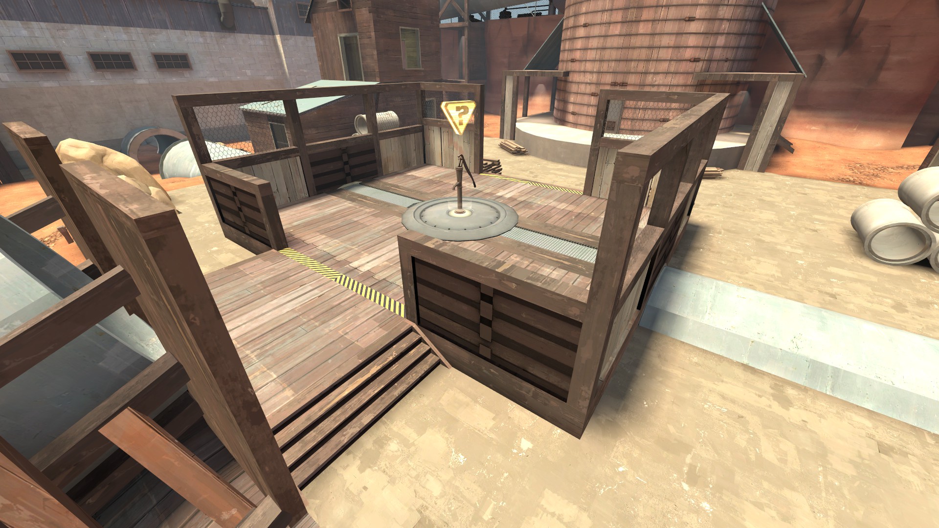
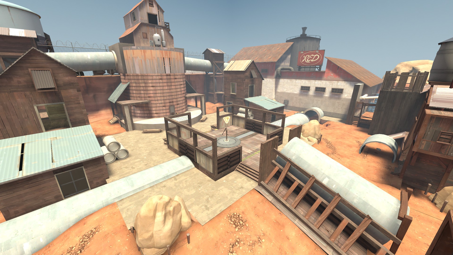
In the end what seemed to work best was a fairly traditional, walled in point, with only two main entrances to defend. This setup made defence more managable, providing engineers with plenty of potential sentry positions.
To address complaints from playtesters that the area containing the large health pickup felt disconnected from the point, I created a hollow pipe connecting the two areas. This allowed for easier access for defenders and helped tie the layout together.
Closing Thoughts
When it came to designing for the different classes, I found there was a fair amount of trial-and-error involved. I took a page from Valve’s own approach not to explicitly design sniper perches and sentry positions, but rather to facilitate them when they appeared. When the general map layout was set, it became a matter of moving things around, adding additional hiding spot for spies where needed, etc.
If I had more time, I’d like to conduct larger scale playtesting, since it’s difficult to judge the balance of a multiplayer map just by playing with friends and bots. Lighting and propping could use some additional work, but overall I’m happy with how the map turned out.
